I make Grabster on my own, so this is where you can see what’s changing. Every release gets an entry here. In between, I explain why things changed, post the odd video, and share a word I grabbed that week. No newsletter and nothing that tracks you — there’s a feed if you want to follow along.
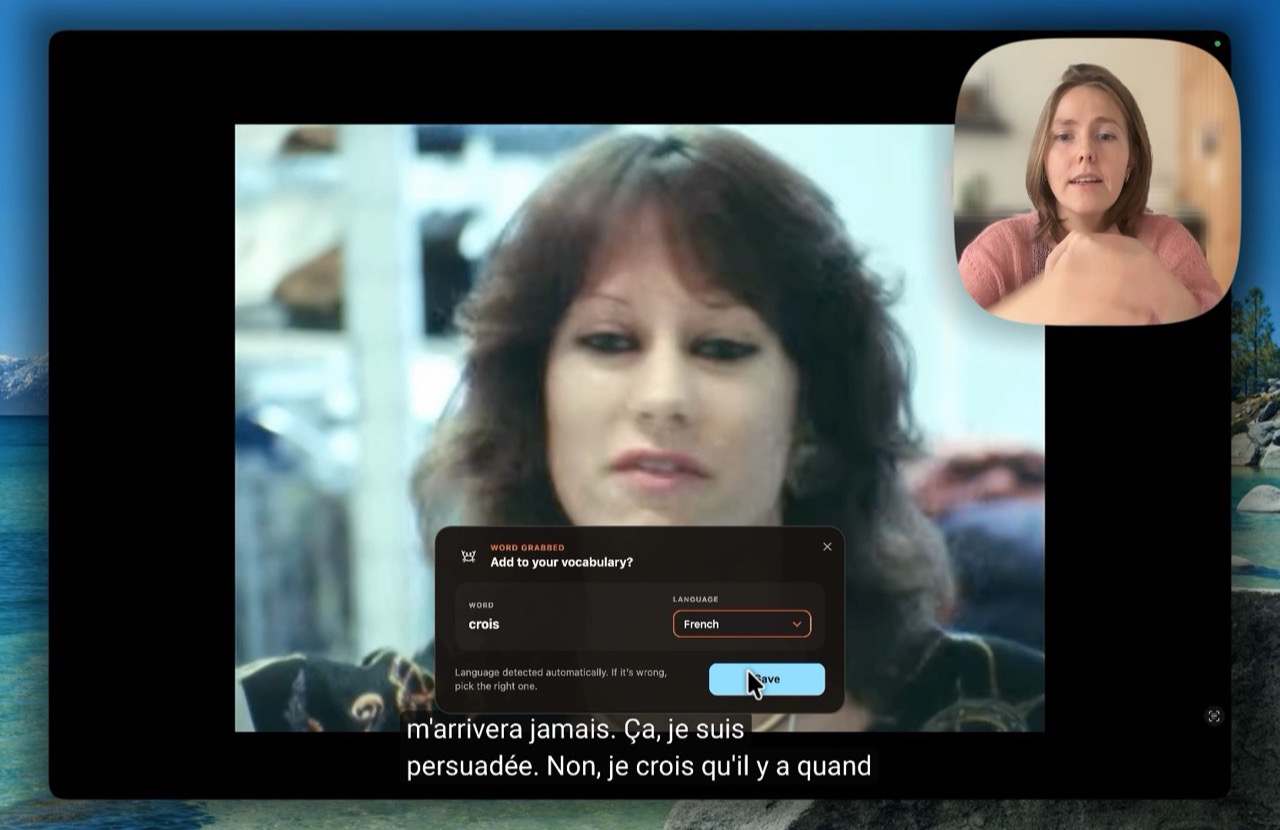
Me, a 1986 TV archive in French, and one word from its subtitles: how a grab works, where the word lands, and what the card looks like when I open Practice. I recorded it on 7 October, so you’ll see the old Save panel from before 0.2.12, but the gesture hasn’t changed.
The biggest change since the beta opened. When you release ⌥Space, the translation shows at the top of the screen, under the notch, instead of in a panel over the subtitle you were reading. The card is still one tap away; it just isn’t in your way. If you preferred the panel, open Settings in the Grabster window, go to Lookups and turn off “Show lookups at the notch”.
The old panel appeared over the subtitle line you had just read, so every grab meant looking away from the show, reading the panel, and finding your place again. The notch is the one spot on a MacBook screen that nothing is ever drawn under, and your eye already goes there for the clock. With the answer up there, nothing covers the show.
It also changes how grabbing feels. A lookup is cheap now, so the notch keeps today’s lookups in a row, and a card is a tap on any of them rather than a decision you have to make the moment you let go. The panel still does two things the notch can’t yet: grabbing several words as one expression, and telling you when a word is saved but waiting because your trial has run out. That’s why the switch back exists (Settings ▸ Lookups ▸ “Show lookups at the notch”), and why it will stay until the notch can do both.
Most grabs are a question, not a commitment. So the panel now answers first: release, and the translation is there. Add card is a second tap, for the words you want to keep.
“Built by one person, in the open.”
macOS 14 or later · Apple Silicon and Intel
 Grabster